real life statistics: your chance for happiness (or misery), 2022

Made as a custom data visualisation presented by Fondata Magazine, this piece was inspired by Professor Xiao-Li Meng's blend of wine and statistics. The work depicted nine wine ratings using a visual vocabulary of symbols, each reflecting mean ratings and a selection of shapes indicating value nuances. Meng, who is the Whipple V.N. Jones Professor of Statistics at Harvard University and the founding Editor-in-Chief of Harvard Data Science Review, embarked on an unexpected journey when one of his students proposed merging wine and statistics. The journey saw the marrying of wine-tasting sessions with statistical lectures, exploring correlations between subjective wine ratings and numerical analysis.
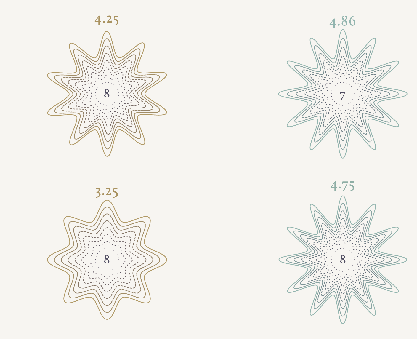
The visualisation for Fondata Magazine made use of distilled data from a nine-figure table, each figure representing ratings assigned to different types of wine. Employing a custom visual language, the piece encoded these ratings using unique symbols. Arranged in three columns, each symbol conveyed the mean rating for a specific wine tasted in sequence. The symbols' contours varied: smoother curves indicated lower ratings, while sharper spikes represented higher values.
The piece sought to illuminate Meng's interdisciplinary teaching method, illustrating complex statistical concepts through the lens of wine tasting. His pioneering blend of wine appreciation and statistical analysis continues to foster new insights, engaging both students and enthusiasts alike.